Brea Art Gallery exterior
The sharp angles of the gallery’s exterior come together at its vertices, building letters out of angles and shapes as onlookers comeup the entrance.
Exiting the gallery?
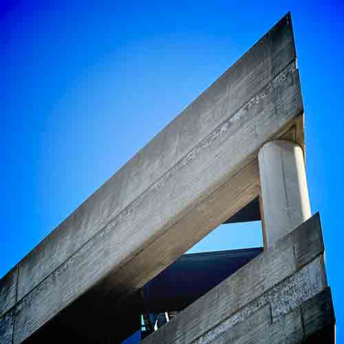
The sharp angles of the gallery’s exterior come together at its vertices, building letters out of angles and shapes as onlookers comeup the entrance.
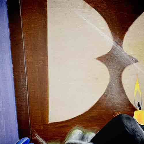
Making up the background decor of April Werle’s 2025 piece, the rounded letter takes shape in acrylic and stain on a wooden panel.
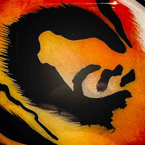
In Eunnuri Lee’s captivating and vibrant piece, a mix of jagged and dashed edges combined with smooth rounded strokes to mimic fur create the letter’s form as they munderneath a glossy panel.
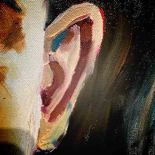
The lining of the subject’s ear in Michael Dixon’s oil painting call’s the fourth letter of the alphabet to the eye. The large piece uses a mix of bright colors and human forms to combine nostalgia with realism.
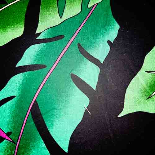
Emma Kapi’olani Hughes mixed language into many details of her fabric piece. Through thread, lace and other mediums, their artistry mixes written and visual poetry.
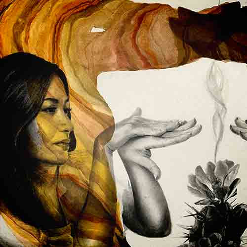
Amanda Kazemi’s mix of watercolor, graphite and pastel uses silhouettes and the human form to build upon alphabetic visuals. The personal value of the work is reflected in its pricelessness.
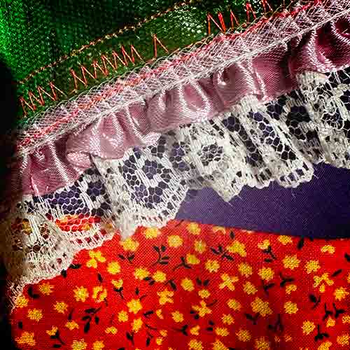
The repetition in the lace pattern used to detail and outline the primary visual elements of Emma Kapi’olani Hughes’ piece swirl into cohesive and legible letters.
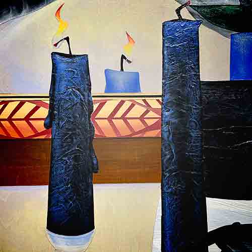
The blending of the foreground and background of the painting push out the letter’s form through a bent perspective in April Werle’s 2025 piece.
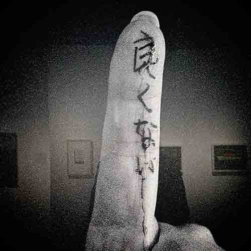
Long Beach’s Hiroshi Clark masterfully uses photography and scale to his advantage in blending culture and details in his surroundings. The figure of his subject and rounded edge resemble the characters of a bold, san-serifed variant of 9th letter.
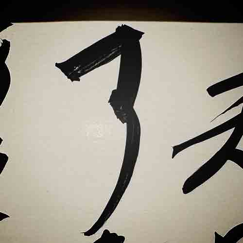
In the calligraphy detailing that borders another inkjet print of the Clark family’s routine, a string of characters derive new meaning when compared to the 10th letter of the English alphabet.
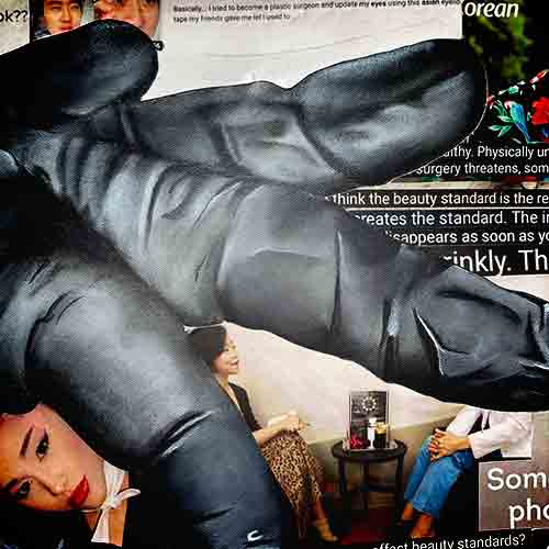
In Eunnuri Lee’s second iteration of her collage piece analyzing American views of Asian people and culture, Lee uses hands to figuratively and literally poke and prod at the Asian-American identity. The multi-pronged appearance matches the angular nature of the letterform.
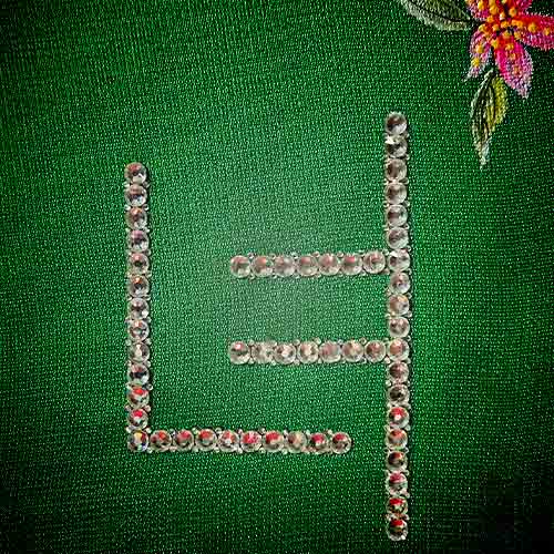
Also coming from LA’s Ennuri Lee, the expensive materials used in the personal project showcase the richness of her culture while contrasting them with perceived exocitism.
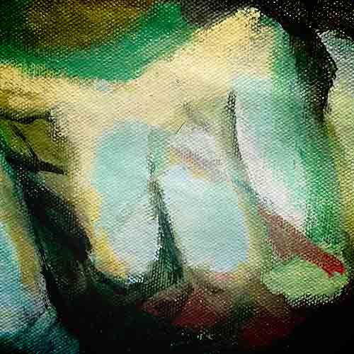
Emma Kapi’olani Hughes’ large fabric piece returns to the alphabetical line up by interpolating the human form into a letterform through shadows and proportion. The angled lighting and position of the hand crafting the shape resembles italic fonts.
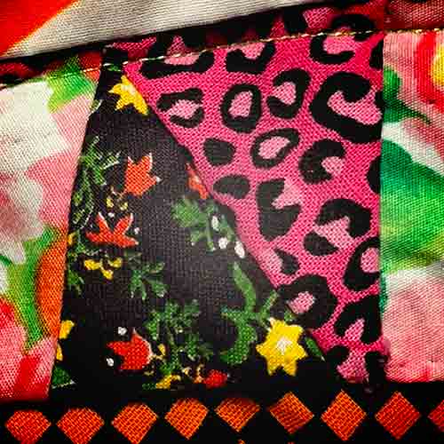
Emma Kapi’olani Hughes creative stitching techniques bring clashing textures together while representing the bonds that stretch across communities. The subtle stitches nestled between the vibrant right triangles create the sharp angles of the letter.
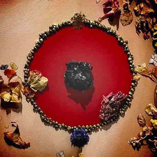
Another work of Ennuri Lee, the 2024 piece outlines the symmetrical character in heirloom pearls and uses the deep and flattened red tone to fill in the empty space left inside. The mica at the core of the piece brings eyes to the center and gives them points to wander from there.
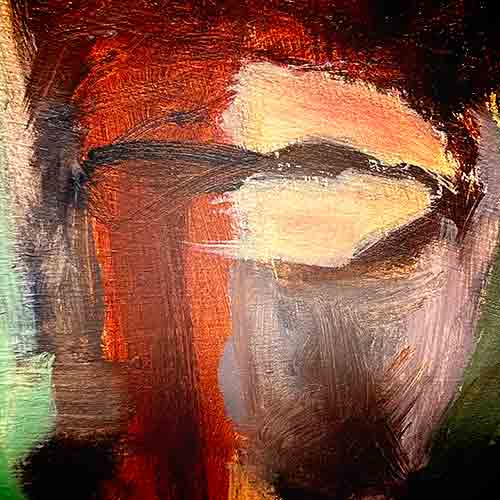
The four year-old piece by Derick Edwards employs the use of chaotic brush stokes to detail distinct hobbies and ideas while giving the impression of a busy and split consciousness. In this chaos on the canvas, letters come into view.
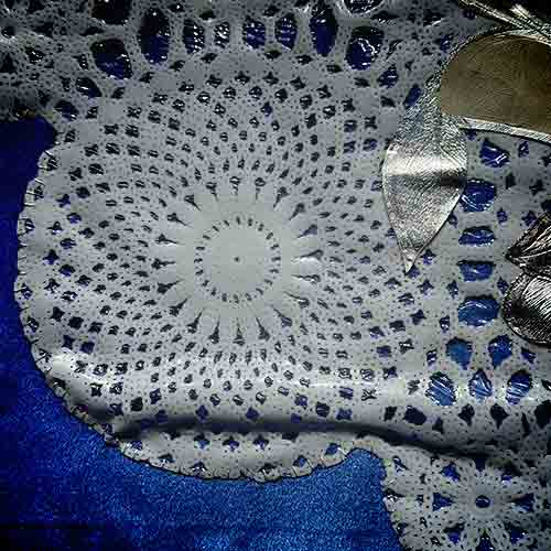
Naima White’s expertise in texture blending is evident in their use of lattice patterns in building a border that tells stories of heritage and heartbreak through her pieces. The blending of round, interconnected shaped combined with the crisp fold of the artwork implies the form of a capital letter.
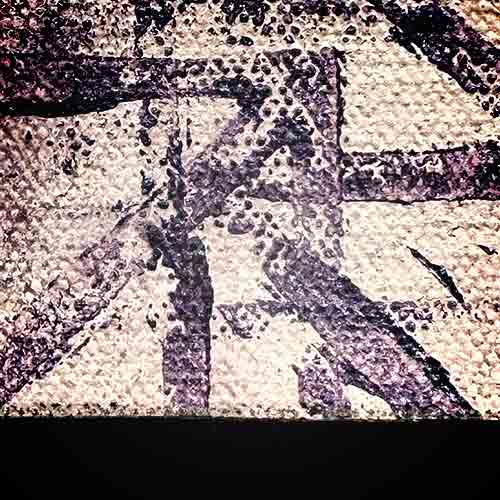
Tucked into the bottom of Derick Edwards’ canvas a sharp version of the letter is formed by intersecting strokes that make up the overlaying texture of Edwards piece. The combination of texture and strong linear forms add to the futuristic tone of the artwork, as implied by its title.
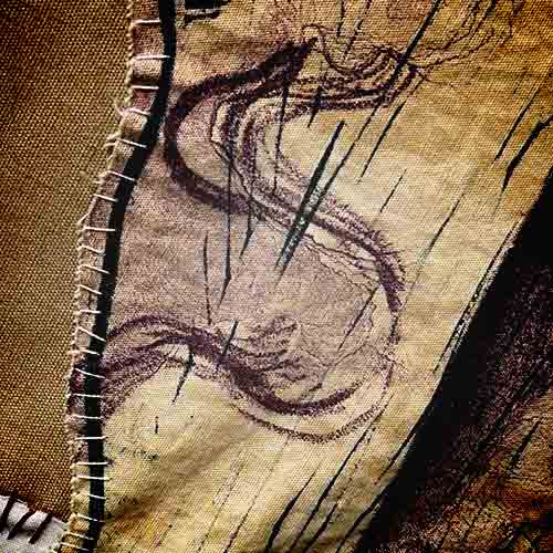
Malaya Tuyay examines the impact of othering and the sexualization of ethnic identities through her expansive piece displayed by itself. The sprawling screenprinting and linoleum piece mixes scale with intricate details that bring reminiscent shapes and letterforms through each of the hands that make up the piece.
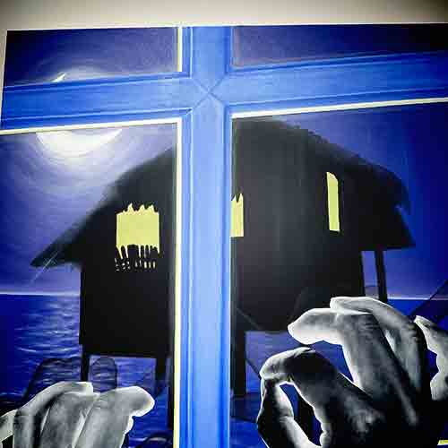
April Werle’s vivid style comes to life again in her 2025 piece that employs directional glows to emphasize key elements of the piece. Built into the foreground and immediately eye-catching, the letter is clear to see.
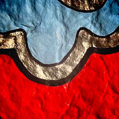
Nestled into the details that separate the contrast of Ennuri Lee’s artwork featuring acrylic and Swarovski crystals, the rounded letter makes itself clear through a textured silver lining.
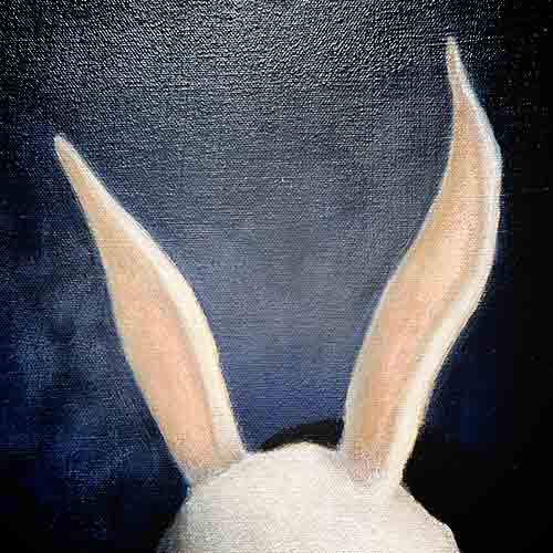
Mary Jo Matsuma balances perception and identity through use of the human form and masks, hinting at exaggerated personas and the moments that allow people to lean into hyperbole. The rigid peaks of the animal-inspired headwear form the outstretching arms of the letter’s shape.
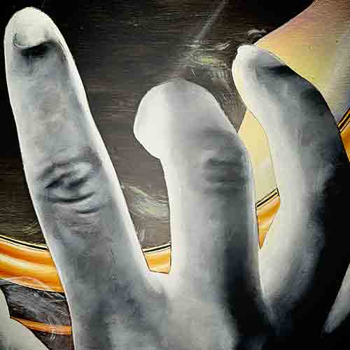
April Werle’s artwork faces ethnic roots and combines it with the innocence that only childhood can provide. The delicate pose of hands creates a multi-pronged form reminiscent of the letter’s shape.
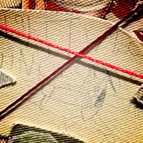
Naima White’s use of multimedia artwork to showcase the journey of her and her heritage is not only powerful for its imagery, but also for the tightly wound thread around it. The overlapping lines represent just how tightly she holds her culture, while also crafting the letterform.
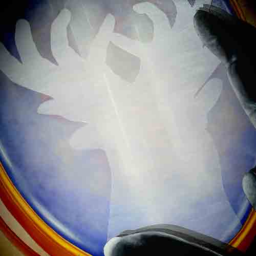
In an exploration of instinct and self-worth, April Werle compares human form to animal equivalents through subtle comparison and reflection. The expansive reflection staring back at the unknown protagonist of the painting reflects the structure of the letter.
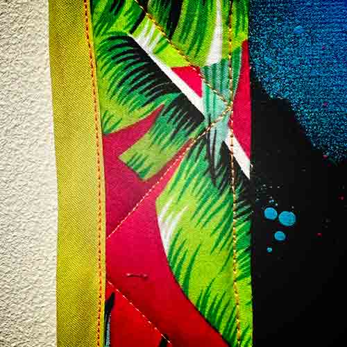
In her take on the quiet essentials of home life, Emma Kapi’olani Hughes implies the letter’s form through vibrant colors dyed onto the stitching. Between loud and contrasting patters the light stitching finds it own way to stand out.
Exiting the gallery?